A workspace is the plane on which a project is designed throughout the phases and actions of VenueTune. This page provides an overview of the various menus and virtual device representations that may be used throughout the phases and actions.
Follow the links below to jump to the topics covered on this page:
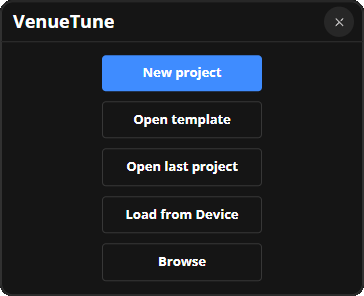
Whenever VenueTune starts, a startup menu will display with a variety of options.
New project: Create a new project.
Open template: Opens file explorer to select a template.
Open last project: Open the latest saved project.
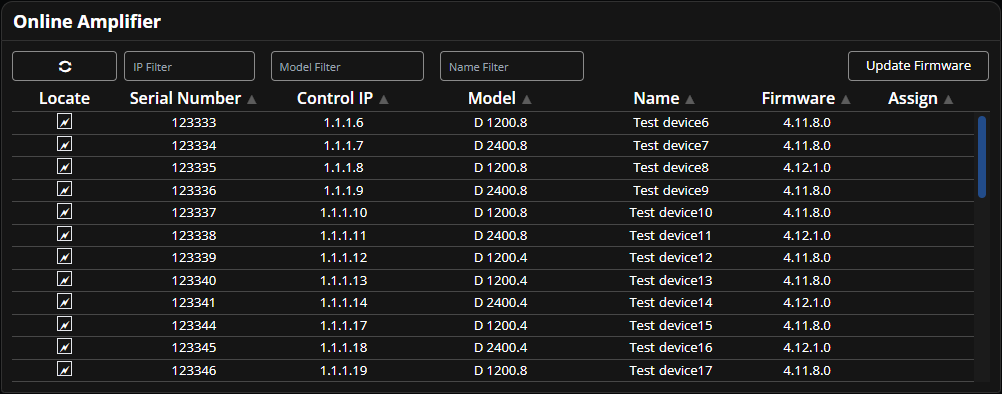
Load from Device: Use Load from Device to extract a project file from a device in the system.
Browse: Use to browse previously saved projects.
Workspaces are divided into two sections, one for speakers and groups, and another for amplifiers and sources. Typically only one or the other will be visible. During actions where both are visible, such as the Match action, there will be a line visible dividing the two sections.
Groups, speakers, sources, and amplifier racks may be moved and organized on the workspace during the Design phase.
To move any virtual device with a mouse, left click and drag it to a place on the workspace. To move a device with touch controls, use a single finger to select the device and drag it to a place on the workspace.
To select one or more devices all at once with a mouse, left click on the plane behind the devices then drag, highlighting any devices in the selected area, release to select all of the virtual devices within the area. To select one or more devices with touch controls, use a single finger on the workspace behind the devices and drag, highlighting any devices in the selected area. Once selected, use your mouse or finger to, click on any of the selected devices and drag all selected devices to a new place on the workspace.
Speakers and groups may only be moved while the Speakers or Groups actions are selected. Amplifiers and sources may only be moved while the Amplifiers or Sources actions are selected.
To adjust the view of the workspace with a mouse, right click and drag to pan. To pan with touch controls, use two fingers on the empty plane of workspace and drag.
The mouse wheel may be used to adjust the zoom of the view. To zoom with touch controls, use two fingers in a pinching motion. move your fingers closer to one another to zoom out and move your fingers further apart to zoom in.
Adjustments to the workspace view may be made during any phase and action combination. Views may be saved using the View menu.
Zoom to Fit is accessed via the drop-down menu in the upper right. Use this to adjust the visible window to fit as many speakers and groups as possible. This option may also be used while speakers and groups are selected to adjust the visible window to fit as close as possible to those selected devices.
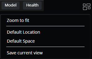
Views are fixed screen placeholders for specific sections of the workspace, such as groups of speakers in the same room or on the same floor. Use the views icon to access the drop-down menu in the upper right of the workspace to name and save the current view. Use this menu to change workspace views by selecting the name of the view. Views may be selected during any phase & action in which speakers and groups are visible.
Views are divided into two sections, location views and custom views. Location views are automatically created when a location is created and the view is centered on that location. Custom views are created using the Save Current View option. If a custom view is selected, the name of that selected view is displayed below the views icon. Delete a custom view by selecting the trash can icon next to the name of that view.
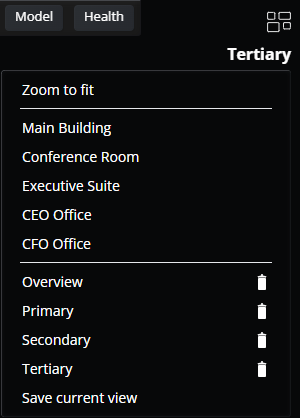
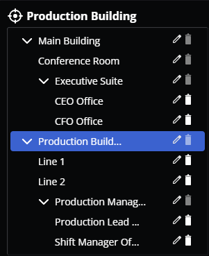
Use the drop-down menu in the upper left of the workspace to select, name, or delete locations. Parent locations, that contain locations, have drop-down toggle arrows on the left. When this is selected, the contained location name(s) will be displayed below the parent location. Delete a location by selecting the trash can icon next to the name of that location.
Note: A location's trashcan icon will darken in color if it contains anything (other locations, speakers, etc...). Only empty locations can be deleted.
Change the selected workspace location by selecting the name of a location, the name of the selected location will display next to the Locations icon. During applicable actions, selecting a location will highlight amplifier racks, speakers, and sources in that location in dark blue.
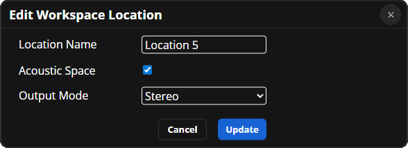
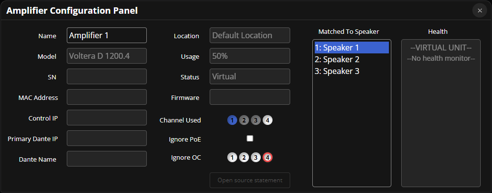
Edit a location by selecting the pencil icon. This provides options to rename the location and a checkbox to select whether it is an acoustic space. If an acoustic space is selected, the option to change the output mode of that location will also be available. See Define Phase - Locations for additional details about adding and using locations.
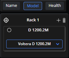
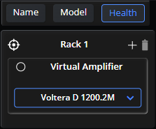
Use the tabs on the Name/Model/Health sub menu to change the information displayed on the virtual speaker, group, or amplifier.
Unique sub menus are available during some actions. Those menus will be displayed directly below the name of the action on the Top Ribbon while it is selected. The tabs and settings for action specific sub menus are explained in each specific phase & action section of the helpfile.
Unique Panel menus are available during some actions. A panel menu is located at the base of the workspace and is usually accessed via the interactive button on a speaker, group, source, or amplifier. The options for specific panel menus are explained in each specific phase & action section of the helpfile.
Use virtual representations of physical devices or groups of devices to organize and manage a workspace.
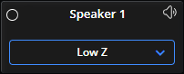
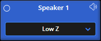
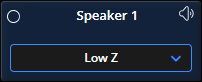
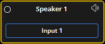
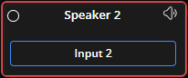
The components of a virtual speaker are the status indicator, speaker name, Mute Toggle, and Interactive button.
Status Indicator: Displays green once the speaker is matched with a virtual amplifier that is linked to a physical device networked to the system. Displays red to indicate a fault or yellow to indicate a warning. Indicator will remain transparent while offline.
Speaker Name: The default speaker name is "Speaker __#__".
Mute Toggle: Displays red with a slash through it while it is muted and red without a slash while it is part of a muted group.
Interactive Button: The functionality of the interactive button is action dependent and is explained in each specific phase & action combination section of the helpfile.
Selection: A speaker is light blue while selected and is dark blue while its assigned group is selected.
Copy & Paste: While one or more speakers are selected, Ctrl+C copies each to the clipboard. Once objects have been copied, Ctrl+V will paste a copy of each of those speakers to the workspace. Both actions have a text prompt to inform or confirm the action.
When limiting is applied to a speaker that speaker displays a colored border.
Yellow: Peak limiter gain reduction less than -3.0.
Red: Peak limiter gain reduction less than -9.0 / Compressor gain reduction less than -0.5.
The components of a group are the status Indicator, group name, mute toggle, and Interactive button.
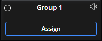
Status Indicator: Displays green once all of the speakers assigned to the group are matched with a virtual amplifier that is linked to a physical device networked to the system (online). Displays yellow if there are a mix of online and offline devices, or devices with warnings are present, within the group. Displays Red if devices with faults are present within the group. Indicator will remain transparent while offline.
Group Name: The default group name is "Group __#__".
Mute Toggle: Displays red with a slash through it while it is muted and orange while one or more of the speakers assigned to it are muted.
Interactive Button: The functionality of the interactive button is action dependent and is explained in each specific phase & action combination section of the helpfile.
Selection: A group is blue while selected.
Copy & Paste: While one or more groups are selected, Ctrl+C copies each to the clipboard. Once objects have been copied, Ctrl+V will paste a copy of each of those groups to the workspace. Both actions have a text prompt to inform or confirm the action. Any copied group will not copy the speaker assignments made for that group.
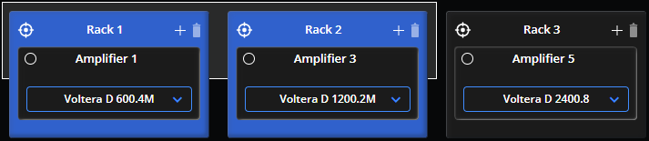
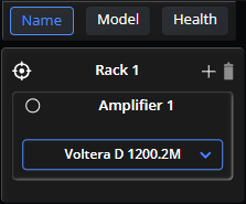
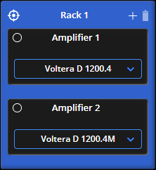
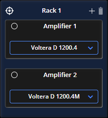
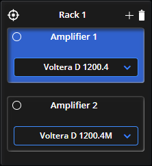
The components of a virtual amplifier rack are the location button, rack name, add amplifier button, trash can icon, and any virtual amplifiers within the rack (details below).
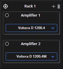
Location Button: Details listed below.
Rack Name: The default rack name is "Rack __#__".
Add Amplifier Button: Details listed below.
Trash Can: The trash can button is used to delete an amplifier from a rack. May only be used while an amplifier within the rack is selected.
Selection: A rack is light blue while selected and is dark blue while its assigned location is selected.
Copy & Paste: While one or more amplifier racks are selected, Ctrl+C copies each to the clipboard. Once objects have been copied, Ctrl+V will paste a copy of each of those amplifier racks, and each amplifier within each of those racks, to the workspace. Both actions have a text prompt to inform or confirm the action.
Use the location button in the upper left the of the rack to change the location of the rack.

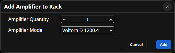
Clicking on the plus button in the upper right of the rack will access the add Amplifier to Rack menu.
Virtual amplifiers sit within a virtual amplifier rack. The components of an amplifier are the status Indicator, amplifier name (default is "Amplifier __#__") and Interactive button.
Status Indicator: Displays green once the amplifier is assigned to a physical device networked to the system. Displays Red if faults are present on the device. Indicator will remain transparent while offline.
Amplifier Name: The default amplifier name is "Amplifier __#__".
Interactive Button: The functionality of the interactive button is action dependent and is explained in each specific phase & action combination section of the helpfile.
Selection: An amplifier is blue while selected.
Copy & Paste: While an amplifier is selected, Ctrl+C copies it to the clipboard. Once copied, Ctrl+V will paste a copy of that amplifier within the same amplifier rack. Both actions have a text prompt to inform or confirm the action.
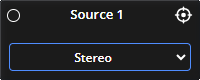
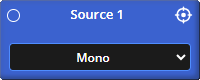
The components of a source are the status Indicator, source name, and Interactive button.
Status Indicator: Displays green once it is linked with a transmitting device.
Source Name: Displays the name as entered into the text field during source creation. There is no default source name.
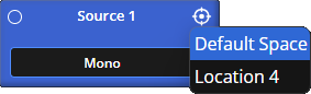
Location Button: Details listed below.
Interactive Button: The functionality of the interactive button is action dependent and is explained in each specific phase & action combination section of the helpfile.
Selection: A source is blue while selected.
Copy & Paste: While one or more sources are selected, Ctrl+C copies each to the clipboard. Once objects have been copied, Ctrl+V will paste a copy of each of those sources to the workspace. Both actions have a text prompt to inform or confirm the action.
Use the location button in the upper right the of the source to change the location of the source.
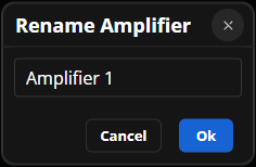
Double clicking on the name of any virtual device, or group, name will access the renaming menu.